|
Forums >
Digital Art and Retouching >
DAR Critiques >
First Retouch Job - Feedback & Critique Please
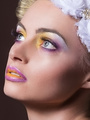
Hi; just completed a retouch job for a friend who is a gay Melbourne-based DJ, and I'm interested to get ModelMayhem's perspective. Parameters were fairly open to my creativity, but the only specification was that I change the background; final image I used for the backdrop is a high-res sequin image I downloaded and digitally manipulated to create a lighting cast and flash highlights. Otherwise, just clear skin, bright colours and camp. The image is to be used for nightclub advertisements and magazines. Keeping this in mind, I was attentive toward not making his skin overly polished and smooth as I wanted to keep it fairly natural and certainly as I know and recognise him. The challenge was removing faint scarring on his forehead; I was hesitant to remove it, but even when I'd lightened and adjusted hue/saturation, I still found my eyes drawn to it. Given that it's not something you notice in person, but is only made noticable by this low key image, I opted to remove it. Original:  Close-Up:  Full Shot Retouched:  Close-Up Retouched:  I enjoyed working on the image, and playing with the colour; I'm pleased with the lighting effects. ========= Okay, let me have it.  Sep 30 14 06:56 am Link So while the overall isn't bad, here are a few things that hurt my eyes. Note that at the top of his head, the blending into the background isn't smooth and you can actually see the edge. Same goes for the edges of his legs. You lightened him up, which is good, considering the different background, but you did it in blanket mode - meaning his legs and underwear are too bright right now. The same happens with the fingers holding the disco ball. You tried to give him a bikini wax- but instead what happened is that now he has this muddy blurred areas. Because the original photo has not many details in the hair, when you added the blue lights it looks less realistic. PS, when editing a face, you should brighten the eyes a bit more than the rest of the face, so they'll look less flat. Especially brown eyes Oct 02 14 08:07 am Link BoazR wrote: +1 I agree with above Oct 02 14 08:18 am Link BoazR wrote: Also, do you have any advice on workflow? Oct 02 14 01:19 pm Link 1. Don't beat yourself up. You should've seen my edges when I just began doing compositing. Every time I see an old work of mine I blush, even if I'm the only one seeing it... Like I keep saying, I believe this is art and not science, therefore only a few methods are wrong. You could use refine edge tool, or work with channels to make a better selection, or even just select menu > modify > contract, then contract it by a pixel or two. 2. You might have done dodge, but you forgot to do the burn part where you darken the places that should be dark. You could do d&b by using two different adjustment layers (curves or levels, whichever you're comfortable with) and paint on the mask. Personally, I prefer setting a layer on soft light blending mode, and paint with black and white with low flow (or opacity, whichever you're comfortable with). 3. I'm guessing you tried using the healing tool. When using it on edges, in this case both the naturally darkening of the area the closer you get to the centre of the body, and the edge of the underwear, there's a smudged result rather than clean healing like you did on the forehead. I suggest you do frequency separation, then heal the high pass layer - it will fix the texture, and not affect colour. 4. Sometimes, you get bad photos. Whether the photographer knows it's bad or not? Doesn't really matter. You take it, make it look the best, then say "wow you did such a wonderful job, I barely had to do anything", because there's no point hurting anyone feelings. On the other hand, if you work with the photographer on a regular basis and you see it's a repeated mistake, you could always suggest that they might want to, let's say, have some more light in the studio. In this image I think the flatness came from the quality of the camera, rather than lights, but you'll have to ask a photographer about, I know like 0 about photography. 5. In workflow you could actually do stuff wrong. The main rule is to work in a way the preserves the original: don't erase > use masks instead. don't do adjustments > instead use adjustment layers. when cropping, make sure your settings keep the parts outside. doing cloning and healing - set the tool on current&below, and work on a new layer. always prefer to work on 16bit mode rather than 8bit. Personally, I work on shape first, then light, then colour - but this is just my way, and others will tell you they do it differently. Hope that helped, B Oct 03 14 12:55 am Link Agree ^ Doge and burn need to blend together smoothly - looks like he was hit hard head-on by bright strobe. You want to make it look realistic not obviously lit artificially. On the crotch area, the hairiness I'm not fond of but on a portrait - it's part of him. The white - whatever it is - got to smooth out the outline of his penis; it's too obvious. Viewer doesn't want to see all the details, size, etc. More blending, smooth it out. The blue light on hair to separate from background - I don't think so much is necessary. You can separate by either darkening the background or lightening it. Here with his dark hair, I'd lighten. The blue hair is distracting. Otherwise good start Oct 24 14 11:11 am Link |